We’ve made more than 600 charts and spent the past year training about 150 people about the secrets to effective data storytelling in our hands-on workshops.
We’ve realised that colour – one of the most critical elements of compelling charts and visuals – is often the most misused or misunderstood.
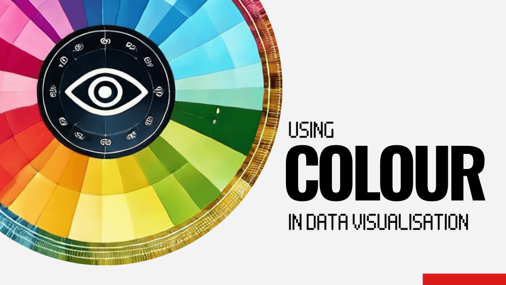
To help you supercharge your stories, we’ve put together a Quick Guide to Colour that distills our insights into how to use colour effectively in data visualisation, complete with real examples, practical tips as well as some of our favourite tools.
Drop your email below, and we’ll send you a guide that will help elevate your data storytelling👇
This FREE GUIDE will help you to:
- Use colour to draw attention
- Design for accessibility and inclusivity
- Flex the feelings associated with colours
- Distinguish between continuous and categorical data
PS: By entering your email you’ll also be signed up to our weekly Outlier newsletter where we share more dataviz news, tips and tricks. We don’t share your data with anyone and you can unsubscribe at any time by clicking on the link at the end of our emails.
🎨 Master the art of communicating with colour
Yes! Please send me the FREE guide to using colour effectively in data visualisation