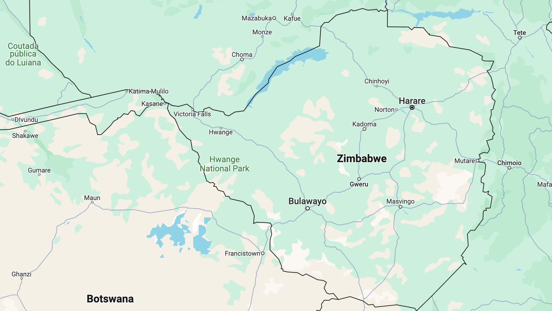
Zimbabwe heads to the polls on 23 August 2023. In this guide, we explain how to find data on earlier Zimbabwean elections and how to map it.
This is part of a series of election maps on the continent. Our previous guides covered Nigeria and Kenya.
Find your data and prep it
The Zimbabwe Electoral Commission (ZEC) has data on registered voters for 2023 and the election results for the 2013 and 2018 elections in its Resource Centre.
The ZEC supplied the data by province, which could be downloaded as an Excel spreadsheet. But the data was locked within a spreadsheet – preventing us from working with it in Excel. To remedy this, we uploaded the spreadsheets into Google Drive and opened them as Google Sheets.
The data we wanted was spread across 10 spreadsheets, so we created a new spreadsheet to consolidate the information we wanted, which was:
- The total voters per candidate per province
- The total percentage of votes per candidate per province
Why did we want this data? We wanted to see which provinces voted for the Zanu-PF candidate and the opposition.
To make it easier to visualise our data, we added in the provincial codes for each of Zimbabwe’s 10 states. We also added links to the original sources for each row of data to make it easier to double-check our work.
Once we had done this, we sorted the spreadsheet on the column to see which parties received the most votes in each province. Using the sorted data, we made a map.
In the 2018 election, Zanu-PF won 50.7% of the vote. The Movement for Democratic Change Alliance won 44.4%.

Map your data
There are two free mapping tools to use to map your data: Datawrapper and Flourish. For this example, we are going to use Flourish.
Flourish doesn’t have a map for Zimbabwe, so we are going to have to add one.
Maps are made up of several datasets. To find all of them go to the Humanitarian Data Exchange.
Then download the zipped file: zwe_admbnda_adm1_zimstat_ocha_20180911.zipSHP.
The reason you download this file and not others is because it contains the boundary lines of Zimbabwe’s provinces. We know this because of the description under the file name.
Once you have downloaded and unzipped the file, open the data into Mapshaper to:
- Confirm you have the correct map
- Simplify the map lines
- Download the map as a GeoJSON file for Flourish


Let’s map it on Flourish!
Start by uploading your map data onto Flourish in ‘regions geometry’ under the ‘Data’ sub-head.
Then fill out the following bits of information in the right-hand panel of ‘regions geometry’:
- Geometry: This is the column with the map picture in it
- ID: This is the column that will correspond to the dataset you want to show
- For this example we used the provincial codes to join the two datasets.
Then select the ‘regions’ tab in ‘Data’ and fill out the following:
- ID – to connect the data with ‘regions geometry’
- Name – to indicate the province or metro
- Colour by – to visualise the data of which region voted for which candidate in the 2018 election

Formatting your map
Your map may appear very small at first when you look at it in ‘preview’. The reason is that Flourish defaults to a ‘World view’. Change the ‘Bounds’ from ‘World view’ to ‘Auto’.
If your map appears squished, it could be because of the choice of projection, which you can adjust to choose a map projection that looks more familiar to you.

Here is what your map could look like in the end if you edited it further in the design interface Figma.
To work on Figma, we downloaded the chart as a .svg file.

