
Last year was the hottest year on record and exceeded the Paris Agreement target of 1.5 degrees Celsius above pre-industrial levels for the first time since records began in 1850.
Disastrous as that is, it does offer a chance to learn more about the different ways that a dataset can be visualised.
Here are five charts that use mostly the same data but tell stories in different ways.
#1 Highlighting the key points
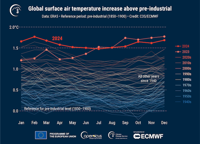
Source: Copernicus Climate Change Service
I like this chart a lot because it mirrors the techniques we teach in our workshops, and then improves on them slightly.
The use of colour evokes an understanding of what’s going on. You can almost feel the (relatively) icy period of the 1940s and 1950s compared with the heat of 2023/2024. The scale on the side also uses colours to mirror a temperature scale, emphasising what’s being looked at.
We usually advise people to de-emphasise the context points (the years before 2023) and emphasise the key values (2023 and 2024). In this case, the lines are coloured very lightly but still provide the context of changing temperature. (Compare this with the next chart which uses the more common greyscale lines for the years before 2023).
Another thing worth noting is that the legend on the right-hand side performs a dual purpose: it tells us which lines are which, and it adds meaning by visualising the change over time. On its own, the legend provides vital information.
#2 Annotating to get the message across
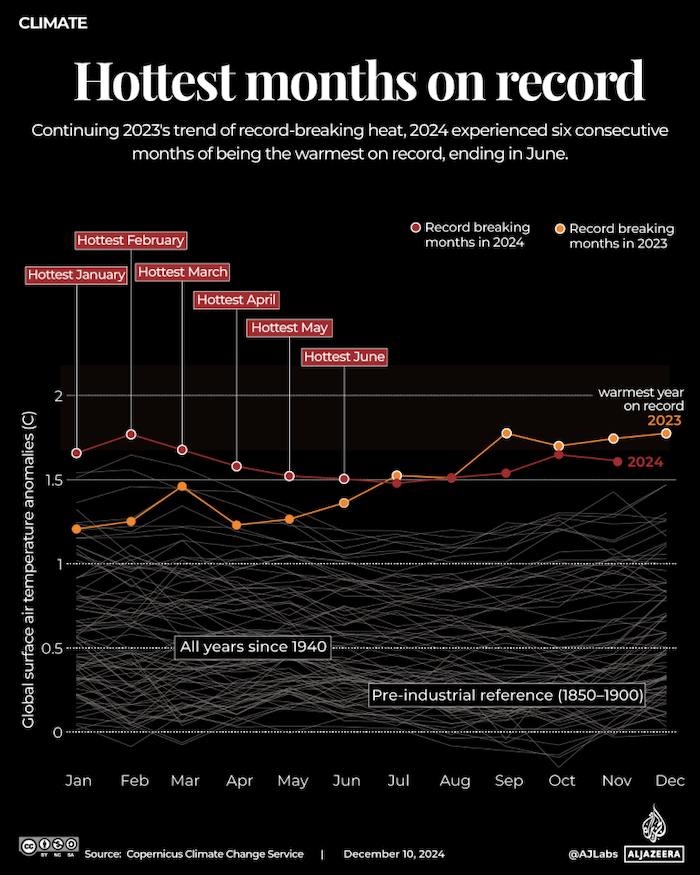
Source: Al Jazeera
This chart is similar to the previous one, but includes extra information. While the previous chart highlights the top two years, this one adds labels for the hottest months, driving home the seriousness of the change. The labels give weight to the fact that 2024 had six of the hottest months. As the data only goes up to November 2024, a full 12-month total is not included.
Annotations can add significant value to a chart when done properly. Without them, readers might only conclude that 2024 was ‘mostly hotter’ than other years. The labels give them additional, ‘quotable’ insights.
This chart uses the more traditional greyscale for lines representing years before 2023. This is generally clearer than using dozens of colours, but the subtle use of colour in the previous chart to indicate change is a good addition.
By offering readers easy takeaways, your charts can have a secondary effect of readers sharing these insights with others.
#3 The ups and downs of a ridge chart
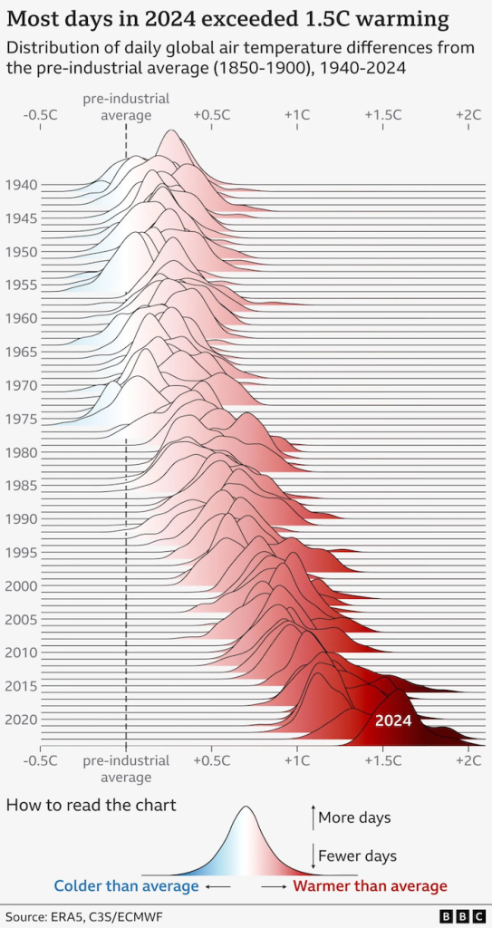
Source: BBC
Ridge charts have become quite popular, and the BBC’s version gives a good idea why. Partly it is because of the charts’ organic shapes. They aren’t particularly useful for accuracy, with the overlapping ridges obscuring some of the data points while making others more prominent. But they do give a clear impression of trends.
Cognitively, readers may take a little while to grasp the specifics of the data but most will quickly and clearly see the pattern. In general, the less time readers need to spend interpreting a chart, the better.
This is probably not the best chart type for most situations, but in this instance, I think it conveys a clear and accessible point. Ultimately, that is why we create charts: to help readers understand and even ‘feel’ the data.
#4 All the stripes

Source: Show your stripes
The climate stripes visualisation is probably one of the most common representations of this data. The version above has been deliberately stripped of all labels. Most readers will immediately recognise what this chart represents. Even if they don’t know the specifics, they are likely to be able to figure out that things are getting hotter thanks to the simple colour gradient. The cool blues shifting to the dark red of the most recent years is instantly understandable. The warming stripes graphic style was created by Ed Hawkins and has become a standard visualisation of climate change.
The latest update adds a new dark red stripe for 2024, a colour introduced last year when 2023 broke all previous records.
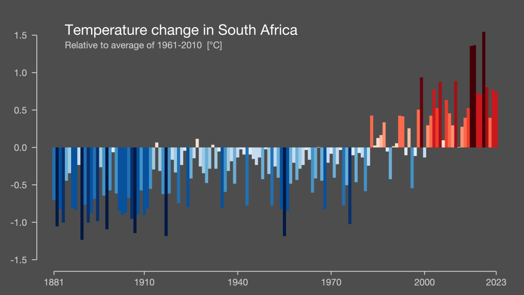
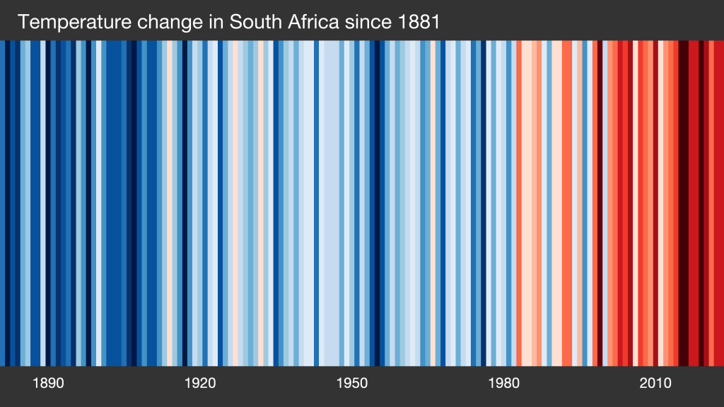
Top tip: Ed Hawkins also runs a website where you can generate climate stripes for different countries. 👇 Here are two variations for South Africa: one is the more traditional vertical 100% stripes; the other is a more descriptive column chart showing changes above and below the baseline.
#5 Back to basics
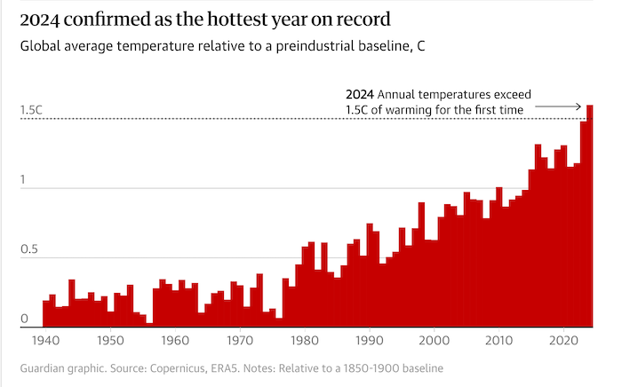
Source: The Guardian
Rather than comparing monthly temperatures, this Guardian chart compares annual temperatures for each year. It also highlights the all-important 1.5 degree Celsius mark, which was breached in 2024. This remarkably simple chart makes a clear point: 2024 was a standout year on the back of 2023, which was itself significantly hotter than previous years.
Again, a single annotation draws attention to the most critical data point, and the bold 1.5 degree line emphasises the exceeded target.
So many ways
One of the things that we often do in our workshops is ask everyone to create a chart. Most participants use the dataset we provide and yet they usually produce vastly different charts, just like the charts above. The key is understanding your audience and what you want to communicate. This will help you decide on the kind of chart to make.
Notebook
- If you’d like to find out more about our data storytelling workshops, visit the Outlier Learning website. We also do custom training. Contact us on hello@theoutlier.co.za
- If you’d like stories like this delivered to your inbox every week, sign up to our free data-driven newsletter.