Category: Data Bites
-

Simple strategies to find the right data for your stories
At The Outlier, we turn data into compelling charts and stories covering everything from health and climate change to food prices and loadshedding. One of the most common questions we get is: Where do we find our data?
-

-

-
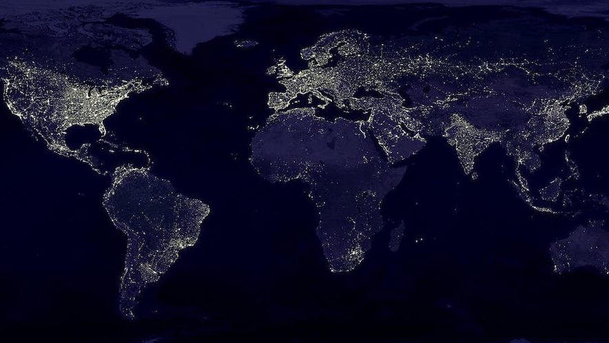
How to make custom maps — even if you don’t know how to code
When programs such as Flourish or Datawrapper don’t have the map format you need, you can make your own custom map. Here’s how.
-
Building projects with Leaflet and SvelteKit
If you’re planning on building projects in SvelteKit, it needs a slightly different set-up to Leaflet.js. Here’s what you need to do to get it to work.
-

5 reasons to switch to OpenRefine to clean data
It has a pretty steep learning curve but it’s definitely worth the effort to learn OpenRefine if you need to clean large amounts of very messy data.
-

How we create custom charts using Flourish and Figma
At The Outlier we publish a lot of static graphics and we like to apply our own styles. Here’s how we do it using Flourish and Figma.
-

Simple guide to scraping data from PDFs
Papers, PDFs and poorly scanned documents are the way most data journalism projects begin. But instead of typing up a new spreadsheet, here’s how to use Adobe Acrobat DC to do all the hard work for you.
-
10 spreadsheet formulas we use to superpower our data analysis
Both Microsoft Excel and Google Sheets are powerful spreadsheet programmes for storing and sorting through mounds of data. Here are our favourite formulas for making sense of data.
-
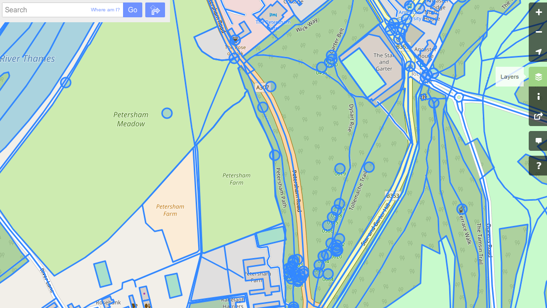
Working with Open Street Map vector data in QGIS
When we teach data journalism most people are eager to make a map but they’re usually unsure of where to get data for a map. And while there are many good sources for map data, if you’re looking for something, like a particular town or neighbourhood, that’s not always so easy. One solution is to…