Category: The Outlier
-
-
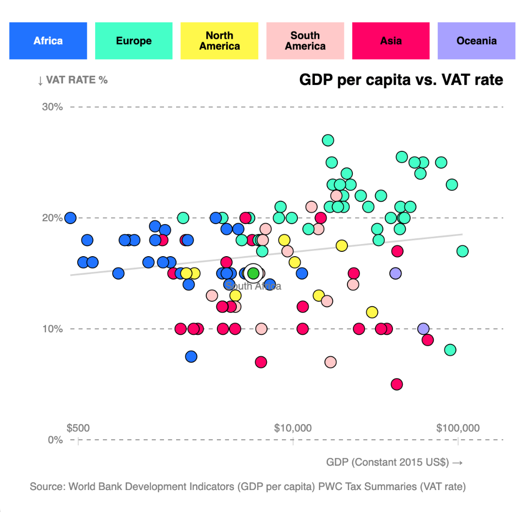
Plotting VAT: A global comparison and South Africa’s place in the mix
Plotting VAT rates against GDP per capita in 120 countries shows that South Africa’s current rate of 15% aligns closely with global norms for economies at similar income levels.
-
SA in 10 charts: Measuring the true state of the nation
A data-driven review of South Africa using key points raised by the president in his state of the nation address as a guide.
-

Simple strategies to find the right data for your stories
At The Outlier, we turn data into compelling charts and stories covering everything from health and climate change to food prices and loadshedding. One of the most common questions we get is: Where do we find our data?
-
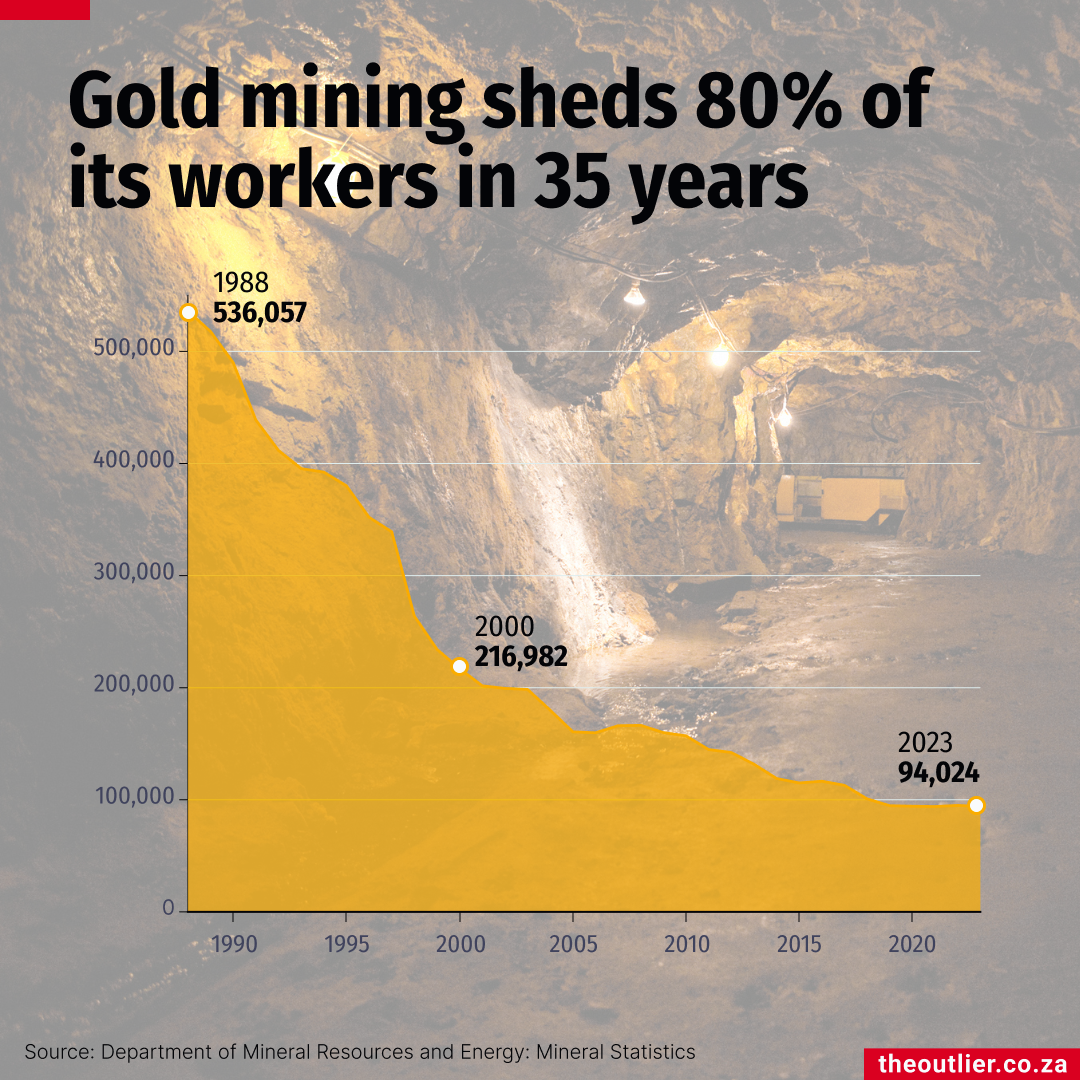
Illegal mining on the rise as SA’s gold industry collapses
South Africa’s mining fatalities hit a record low in 2024, but illegal mining is fast becoming a crisis for the industry. As gold mines shut down, informal miners – known as zama zamas – risk their lives extracting residual gold under dangerous conditions.
-
-

-
-