There are more than 650 charts in the Our World In Charts collection, 200+ of which have been produced during the course of 2024. Here are eight charts selected by members of The Outlier’s team as standout examples of the work we’ve covered this year.
Alastair Otter, co-founder and head of tech
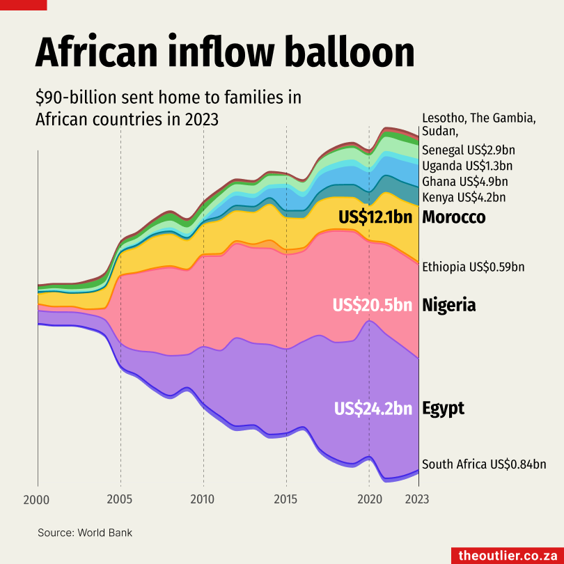
I like the African inflows balloon chart because it is visually appealing and different to a lot of what we normally do. At the same time, it speaks to the underlying idea of the massive increase in remittances to African countries. It’s hard not to see the ‘ballooning’ even before reading the text.
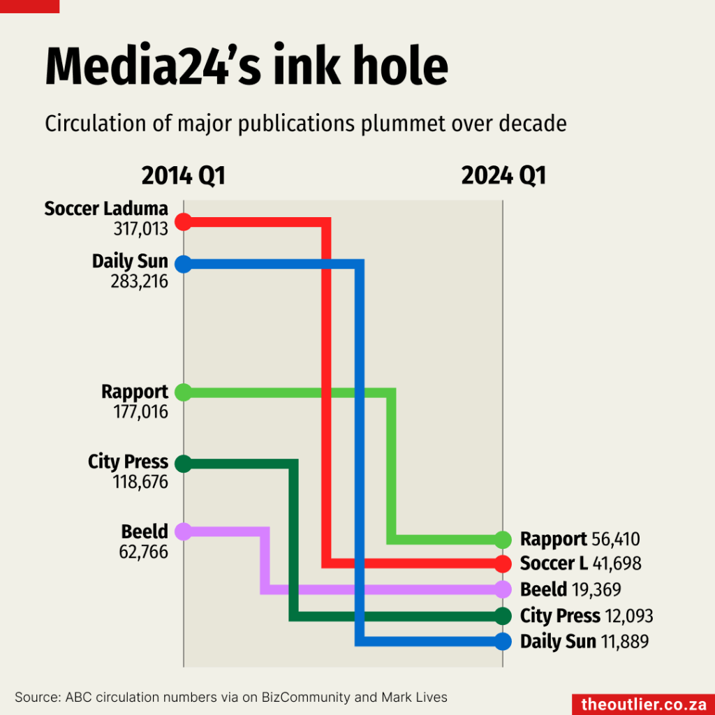
I had a hand in creating many of the charts, so I’m probably biased and need to choose more than one. My second would be Media 24’s ink hole, for most of the same reasons as above.
Laura Grant, co-founder and head of data
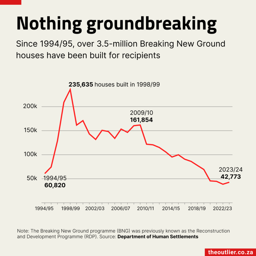
I like simple charts that show a clear insight. This is one reveals a lot about South Africa’s housing crisis. There were 3-million people on the housing needs register in 2024, but the government took 30 years to build 3.5-million houses and the number of ‘breaking new ground’ houses built has been dropping for more than a decade.
Gemma Gatticchi, data researcher
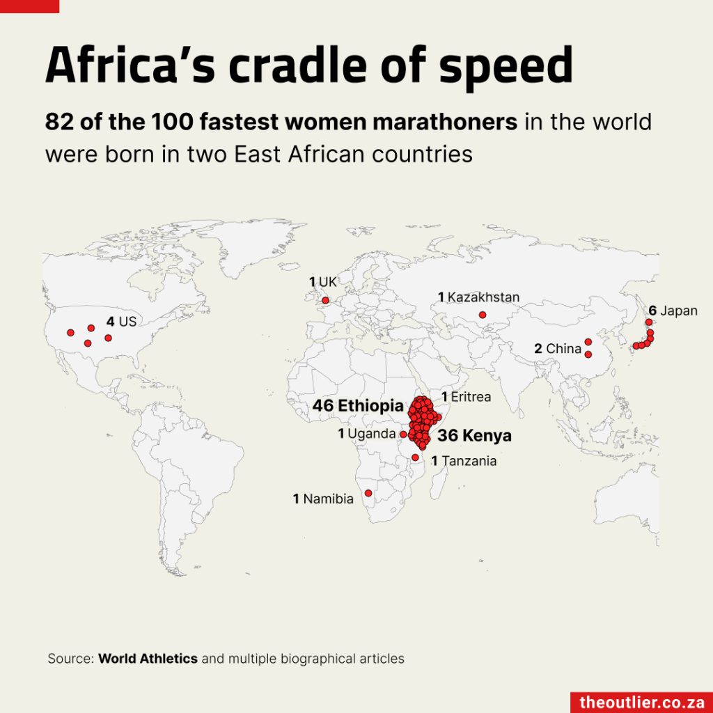
I like the way the Africa’s cradle of speed chart shows how geography, culture and determination merge in the Rift Valley to produce the world’s fastest female runners. The clustering of red dots on one area is really remarkable. It was fascinating to learn how that region’s high altitude, traditional diets and cultural practices help shape extraordinary athletic talent.
Gemma Ritchie, data researcher
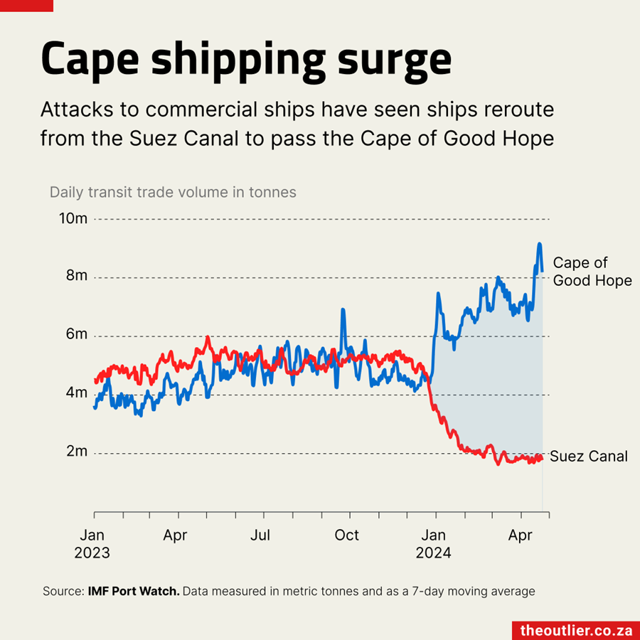
The Cape shipping surge chart is my favourite as it shows how data can add context to a story – in this case how shipping routes were affected by attacks on the Red Sea, forcing many cargo ships to reroute around the Cape of Good Hope.
Ro Manoim, data analyst
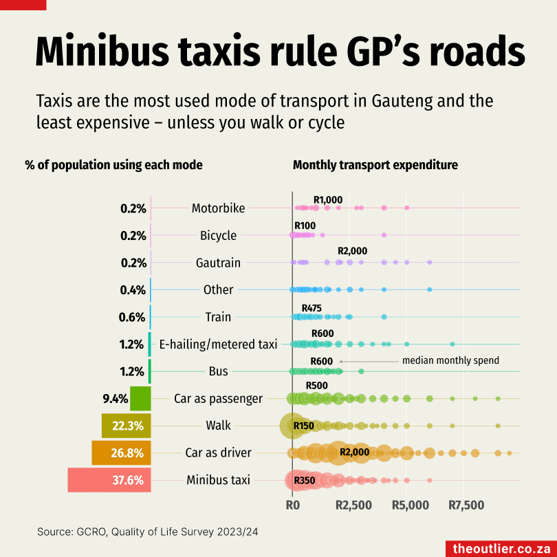
I like colours and I like using them to put different pieces of data together. The minibus taxis rule the road chart shows quite a lot of information – how many people use each mode of transport; how much most people spend on transport each month; as well as the wide range spent by users of different modes of transport in Gauteng.
Anne Taylor
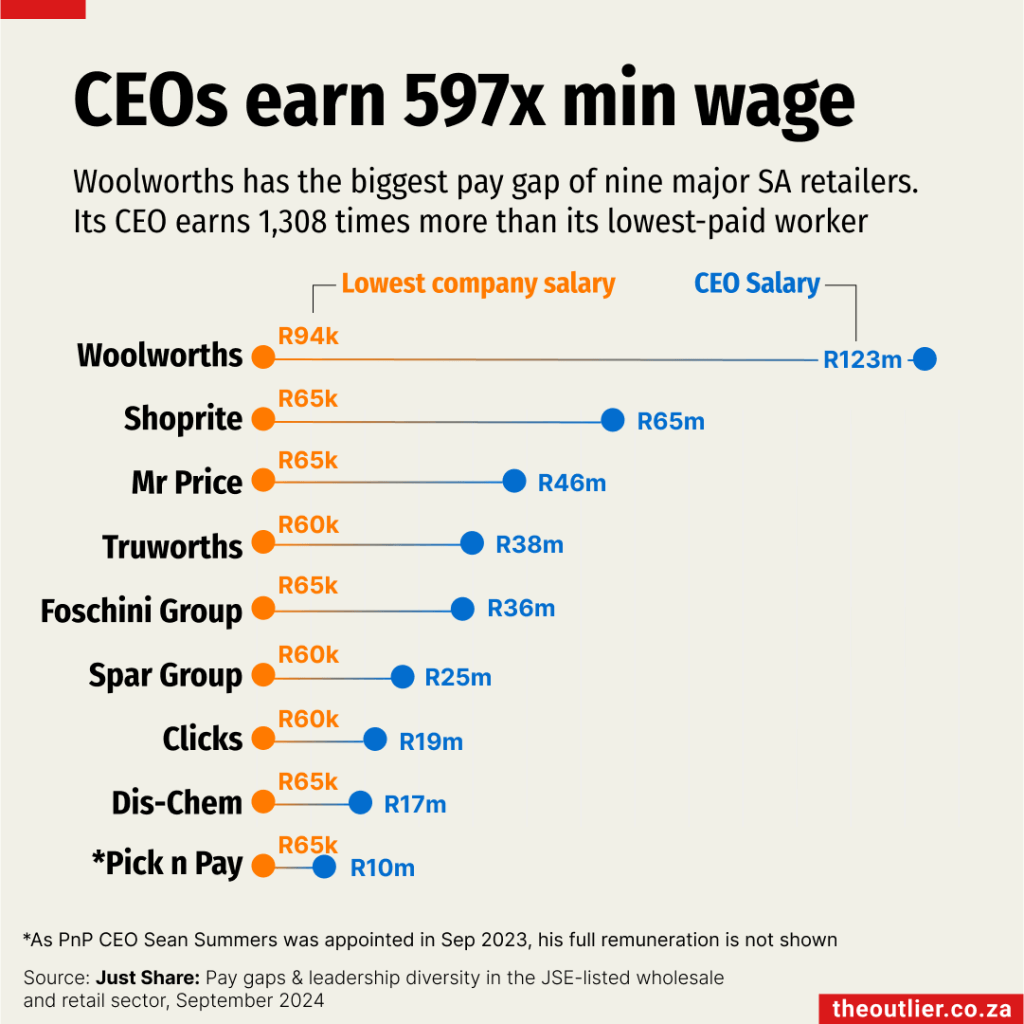
I spent a lot of time thinking about the CEOs’ salaries chart after it was published – probably because it’s a deceptively simple but accurate representation of our complex country. The single horizontal scale with the high-low juxtapositioning of salaries makes a point in a way rows of numbers never would. That a CEO could earn 1,308 times more than their lowest-paid worker left my jaw on the floor – and forced me into some valuable conversations about equity, equality and accountability.
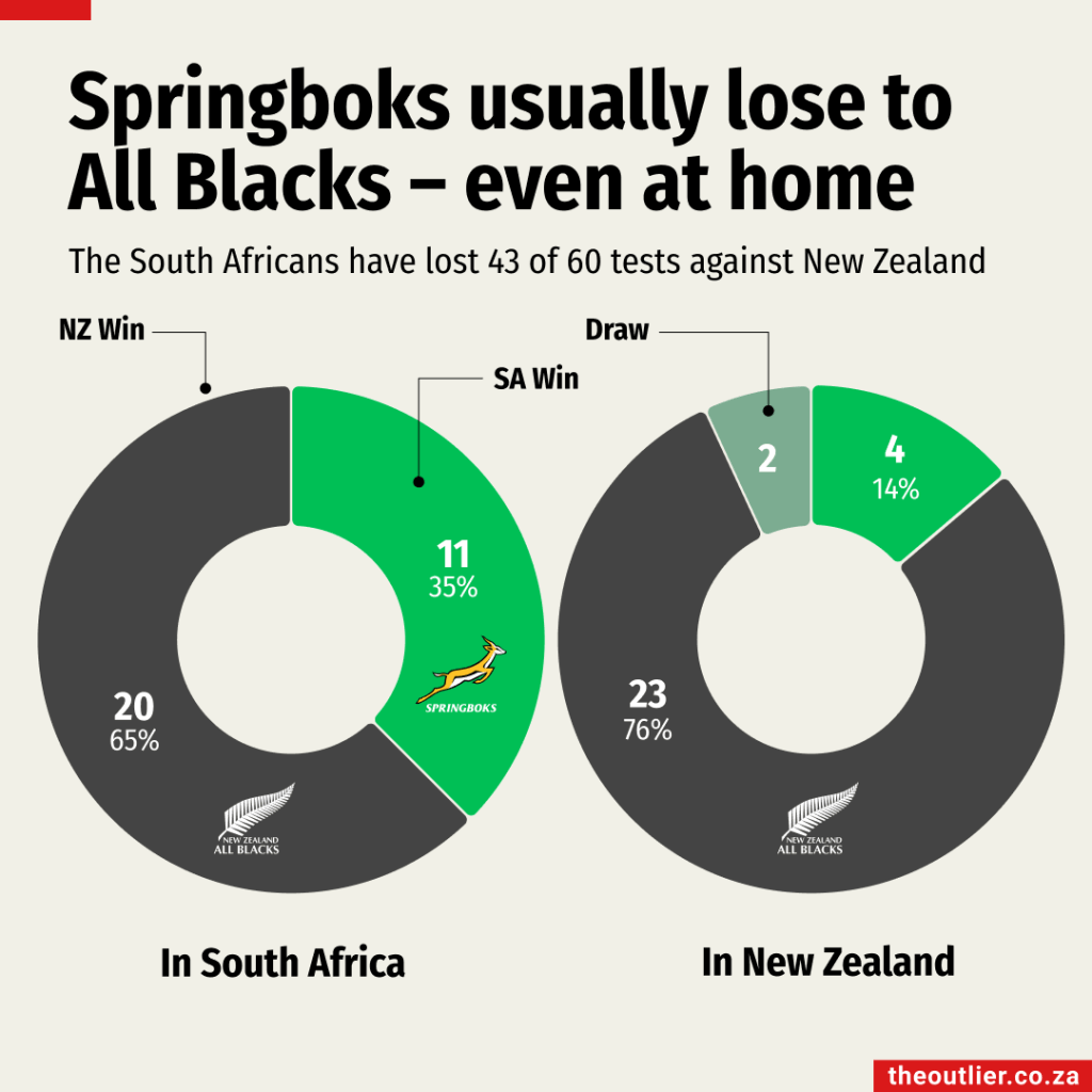
Anne’s actual favourite: Sneaking this one in because putting together the newsletter on homeground advantage ahead of the All Blacks tour to South Africa in September was loads of fun. Ro, who has her master’s in data science, had just started at The Outlier. She was assigned the task of crunching the data while I wrote the words.
Starting off, Ro asked me: ‘So is the team that gets the most points the one that wins?’ Clearly, being a data scientist doesn’t guarantee you know anything about sport! But we got over the line with a great newsletter, helped by Alastair adding his special brand of finesse to the charts. Best bit? The Springboks went on to clobber the visitors, pushing their home win rate to within much more acceptable margins.
Notebook
- Can you guess what the most-viewed charts on The Outlier were in 2024? Check out the Top 15