Category: How To
-

Simple strategies to find the right data for your stories
At The Outlier, we turn data into compelling charts and stories covering everything from health and climate change to food prices and loadshedding. One of the most common questions we get is: Where do we find our data?
-

-

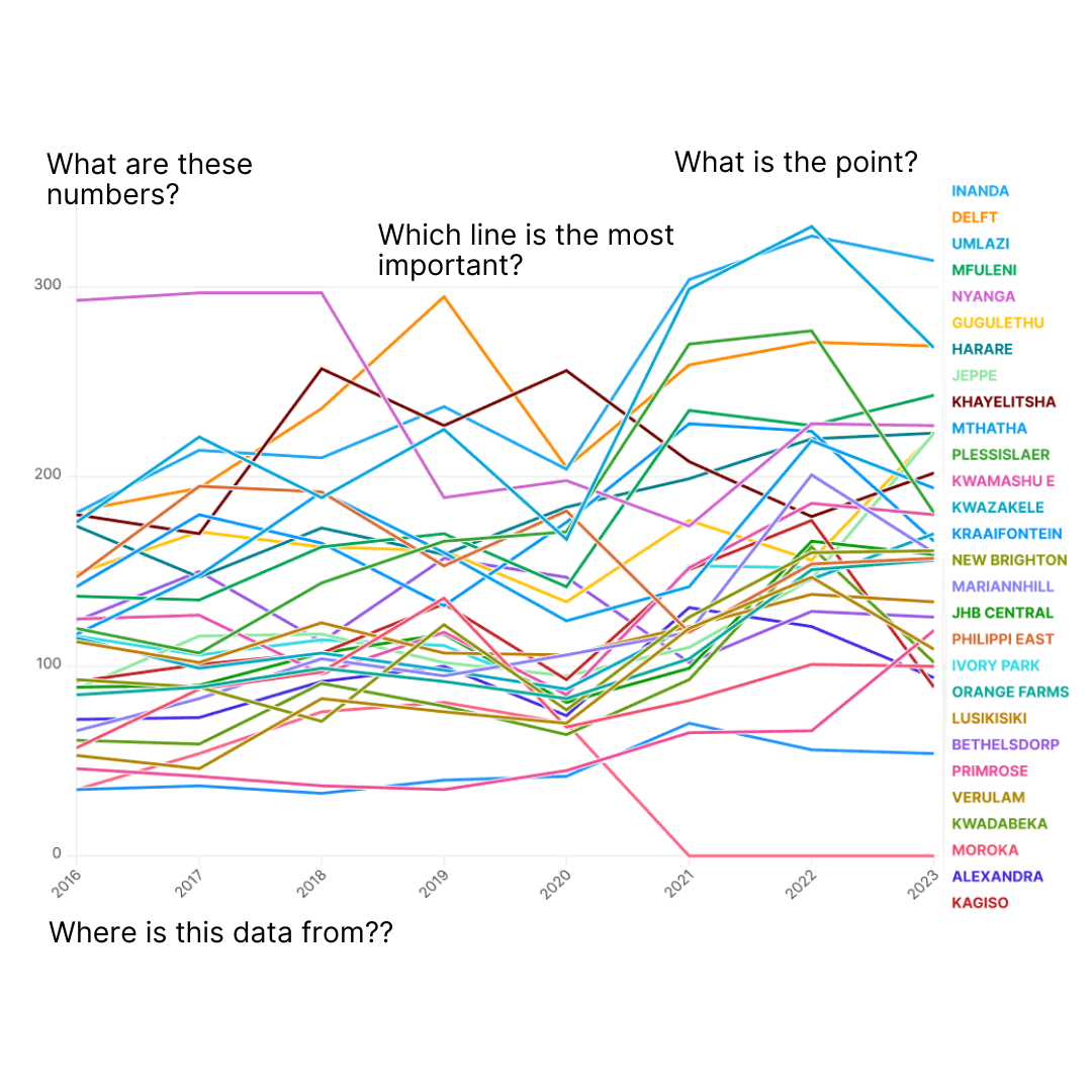
7 chart tips for faster, clearer data storytelling
A great chart delivers insight instantly, helping readers understand complex stories in seconds. When done well, charts aren’t just a supplement: they are journalism, in a more visual form.
-
OpenRefine Part 3: Fixing inconsistencies with the cluster and edit tool
If you’re still on the fence about using OpenRefine or feel intimidated by its features, this tutorial will walk you through two of its most powerful tools: clustering and editing. These tools will help you clean and standardise your dataset, saving hours of work.
-
OpenRefine Part 2: Removing duplicates and using version history
OpenRefine is one of The Outlier’s favourite tools when working with large datasets. This powerful open-source program is ideal for cleaning messy data. In this post, we focus on two essential features: removing duplicates and using version history to keep track of your changes.
-
OpenRefine Part 1: Installing and merging datasets
If you find yourself getting bogged down when you’re working with large datasets in Excel or Google Sheets, OpenRefine might be the solution you’ve been looking for.
-
-
-

The tools we use to make our charts and dashboards
We often get asked what tools power the hundreds of charts and dashboards we produce at The Outlier. From data crunching in Google Sheets to designing with Flourish and Figma, we’ve fine-tuned a process for creating both static and interactive visuals. Our special data deep dives are built with Svelte and D3.js to help bring…
-
Unlock the power of colour
To help you supercharge your stories, we’ve put together a quick guide to colour that distills our insights into how to use colour effectively in data visualisation, complete with real examples, practical tips as well as some of our favourite tools. 🔗 Get your free copy of The Outlier’s guide to colour