Tag: data visualisation
-

Plotting VAT: A global comparison and South Africa’s place in the mix
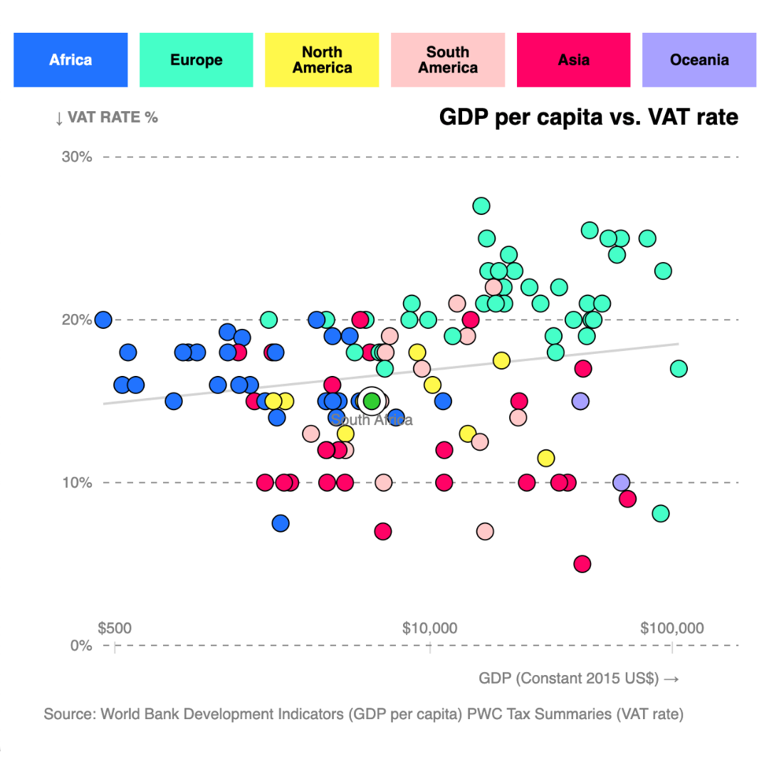
Plotting VAT rates against GDP per capita in 120 countries shows that South Africa’s current rate of 15% aligns closely with global norms for economies at similar income levels.
-

-

7 chart tips for faster, clearer data storytelling
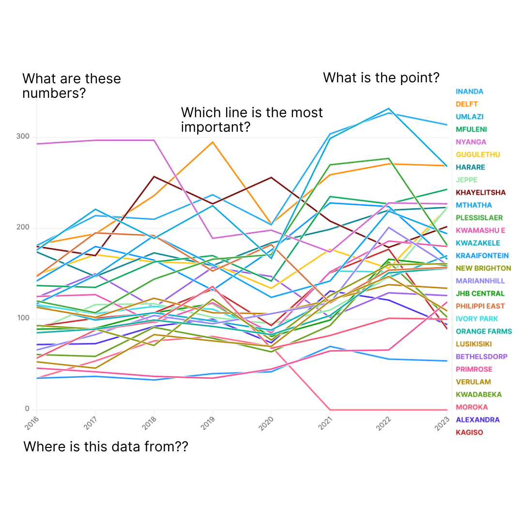
A great chart delivers insight instantly, helping readers understand complex stories in seconds. When done well, charts aren’t just a supplement: they are journalism, in a more visual form.
-
Outlier favourites: 8 charts that hit the mark in 2024
There are more than 650 charts in the Our World In Charts collection, 200+ of which have been produced during the course of 2024. Here are eight charts selected by members of The Outlier’s team as standout examples of the work we’ve covered this year.
-
2024: The Outlier’s Year in Review
It’s been a huge year for training for us at The Outlier. We’ve run our in-person Data Storytelling workshop more than a dozen times, training close to 150 people.
-
Top of the charts: 15 most-viewed visualisations of 2024
The Outlier’s collection of charts surpassed the 650-mark this year, an accomplishment our small team is very proud of. Here’s a list the 15 most-viewed charts on our website this year, which cover topics as diverse as politics, television, travel and, of course, money.
-

-

How to make a Zimbabwean elections map
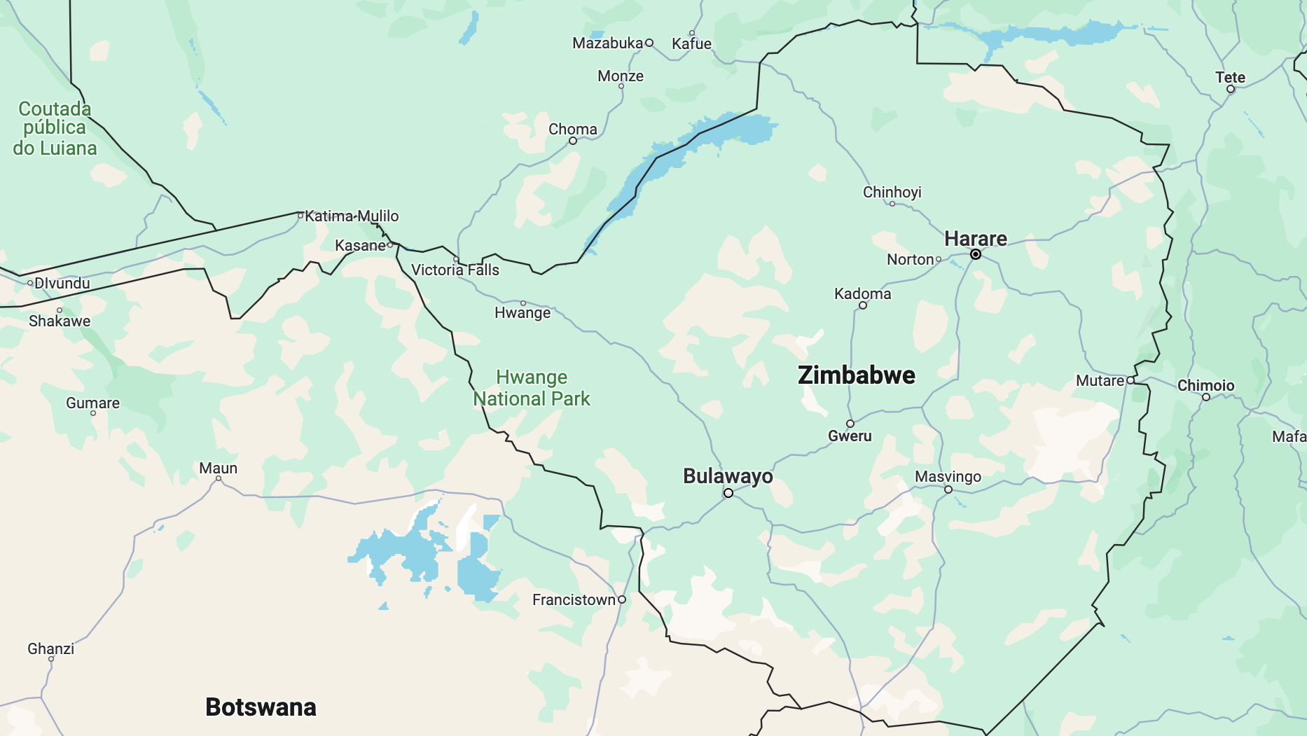
In the latest in our series on creating African election maps, we explain how to find data on Zimbabwean elections and how to map it.
-

Why we told the story of South Africa’s deadliest storm
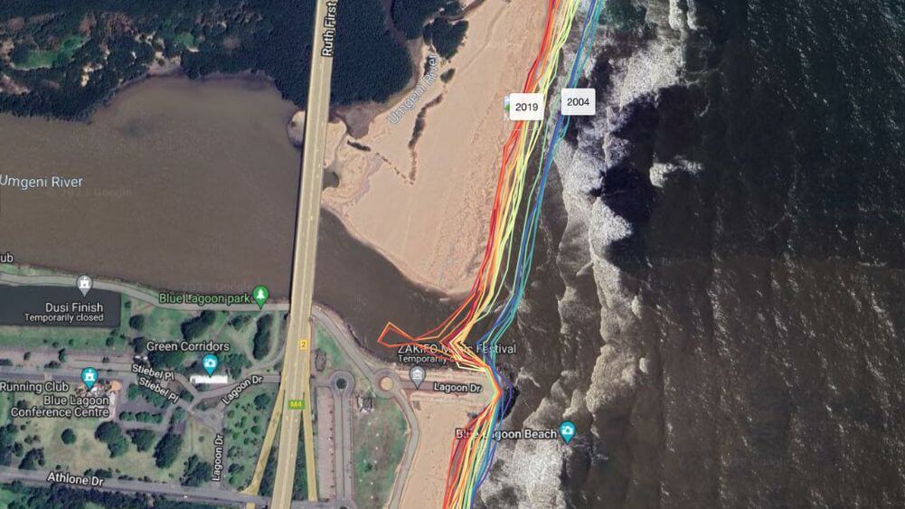
Telling the story of Durban’s 2022 floods was not to document disaster, but rather an investigation into what we can learn from that night